Above are static image versions of the Environmental Management Solution Experience Builder and are not interactive.
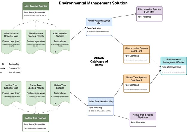
One solution developed is an Environmental Management Solution to help track and report progress on alien invasive species and native trees on campus. This solution was designed to have an open method of collecting data and an interactive solution to display this data. This solution uses the Esri products of Survey123, Field Maps, Dashboards, Experience Builder and Web Maps.
The first step in designing this solution was creating two Survey123 surveys, one for collecting data on alien invasive species and the second for collecting data on native tree species. When published, these surveys produced three AGOL items (a hosted feature layer, a hosted feature layer, view of the results, and a hosted feature layer, view of the form). The surveys were based on questions that were provided by the client.
The first web map is used to display the alien invasive species recorded on campus, using the hosted feature layer created from the survey. This map uses the base map “BasemapVTPK_BuildingLabels”. When deciding on the colors to use to represent each individual species, colors were matched to photos of the plants themselves, which the client provided. The second web map created for this solution was the Native Tree Species map. This map was created using the hosted feature layer created from the corresponding survey and uses the base maps “BasemapVTPK_BuildingLabels”. Trees recorded are symbolized with a tree on the map.
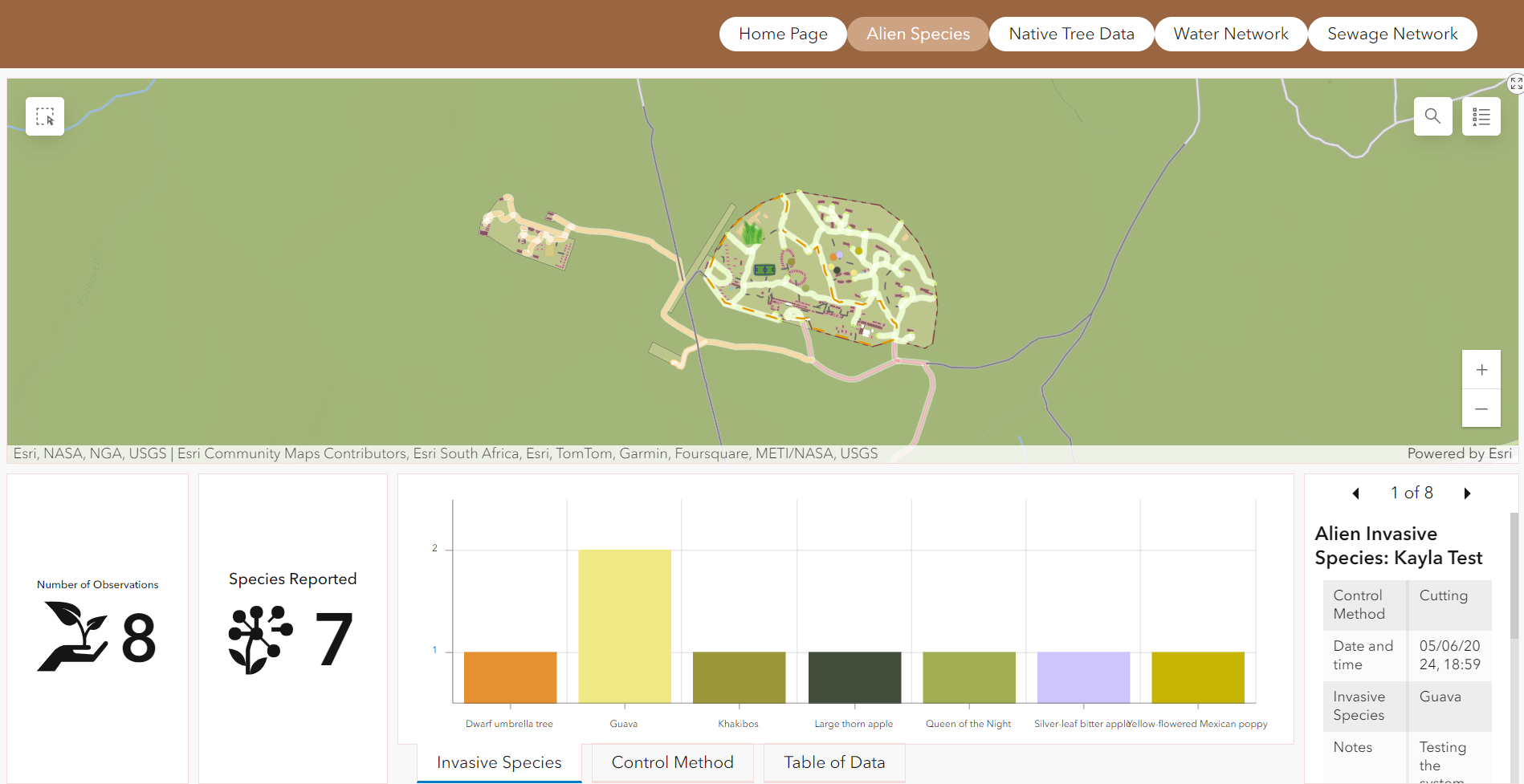
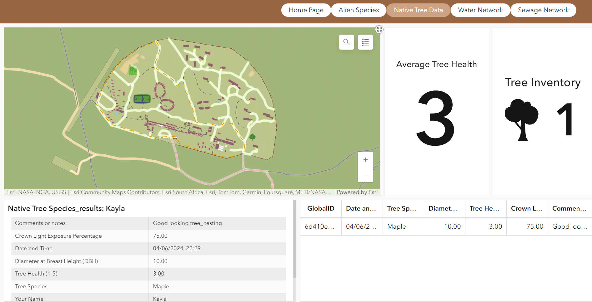
Using the web maps and survey results data designed for both the Alien Invasive Species and the Native Tree Species, two dashboards were designed to give a visualization of the results. The Alien Invasive Species Dashboard outlines the web map showing where all collected points are, how many observations have been made, and how many unique species recorded. The dashboard has two bar graphs, one outlining the control methods used and the second breaking down the invasive species by plant recorded. The Native Tree Dashboard outlines the web map showing where all collected points are, number of trees recorded, the average tree health for all trees recorded as well as a table outlining all the data collected.
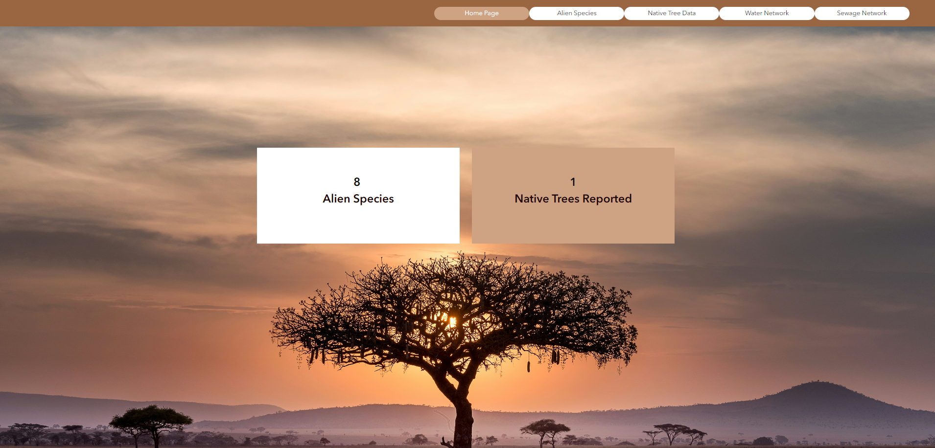
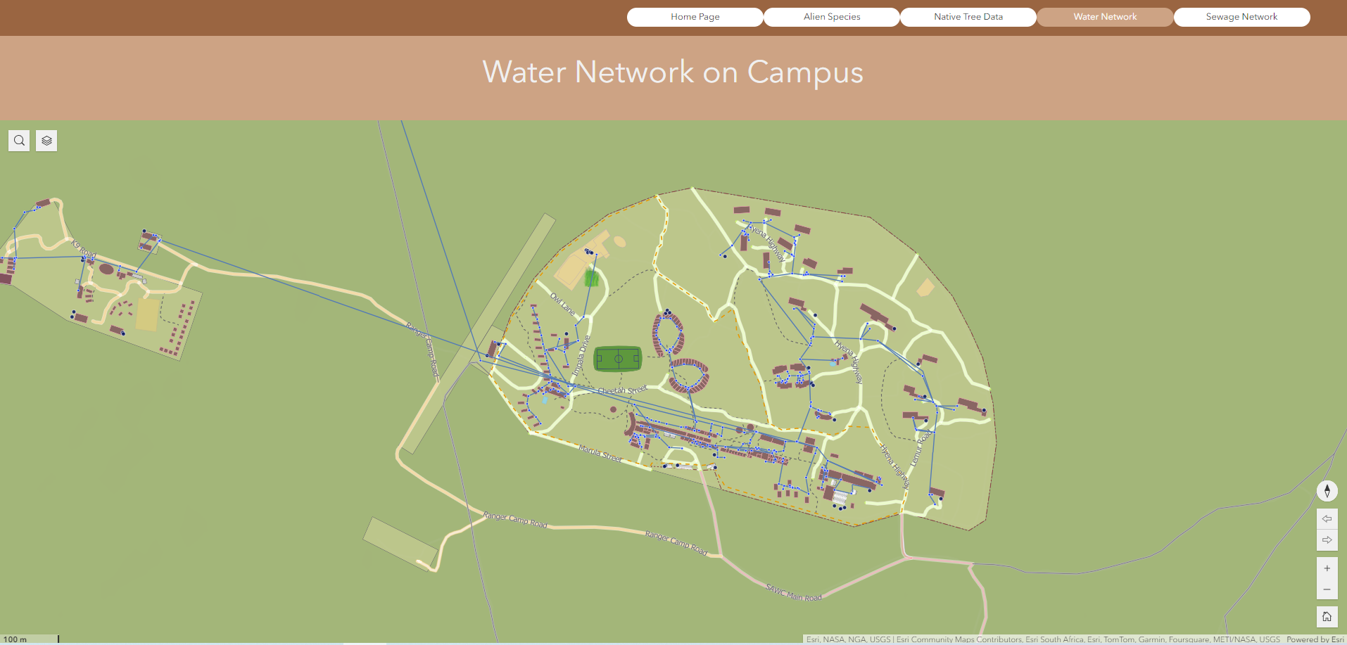
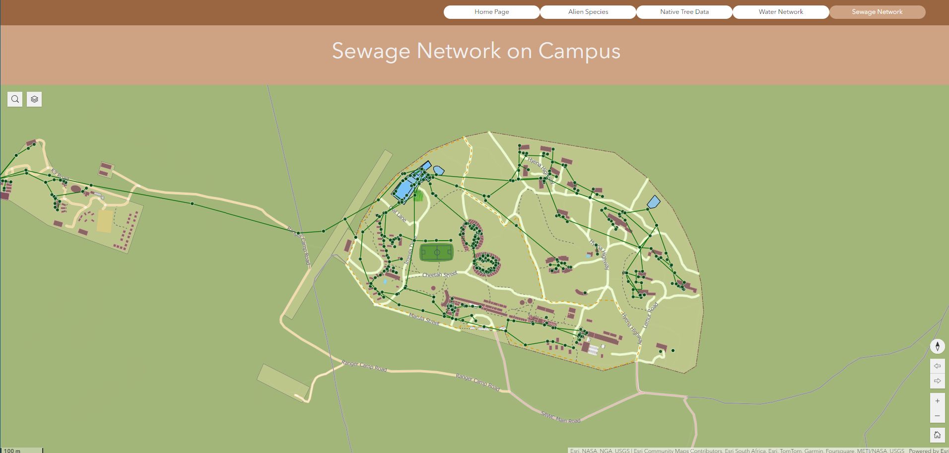
Using the information outlined in Steps 1-3, the 5 pages of the experience builder were created. The home page is comprised of a background photo, as well as two text boxes. Each text box is connected to the survey results data, outlining the number of survey entries submitted for the corresponding survey. The second page of the experience builder is designed as an embed widget, that embeds the link to the Alien Species Dashboard on the full screen on the page. The third page of the experience builder is designed as an embed widget, that embeds the link to the Native Tree Species Dashboard on the full screen on the page. The fourth page of the experience builder is a web map widget, that connects to the Water Network Operational Map. This map outlines the water network on campus, with the option to turn on the sewage and electrical lines. The fifth page of the experience builder is a web map widget, that connects to the Sewage Network Operational Map. This map outlines the sewage network on campus, with the option to turn on the water and electrical lines
Once the experience builder was built, the team created Field Maps for both the Alien Species web maps and the Native Tree Species web maps. Using the Field Maps builder on AGOL, each individual web map was selected, and forms were built with the original survey questions. This will allow users of this solution to revisit the same species entered over time and make any appropriate edits to the data.
Next, edit the dashboards and requests centers to match clients name and needs. By selecting and editing each dashboard separately from your contents page, update the titles and names of the dashboards to match the project. You can do this by clicking “edit dashboard” and once in the dashboard, you can edit every part of the dashboard by clicking the “…” over every component and opening the settings, called “configure”. On the dashboard, ensure the data being presented makes sense in relation to the project goals and select new questions to be presented in the graph area if needed.